
Here’s a few images showing some of the process behind the creation of the Cubes I made for the recent Splore festival 2010 (see previous post). The brief and concept was all about creating something for festival goers to enjoy, interact, have fun and tie in with the theme of Midsummer Nights Dream 2050. An added essential was that it had to be able to survive 3 days with 7,000 people…
The concept I came up with was to build sixteen 40cm squared cubes with letters on several sides, patterns on another and one side that when fitted together correctly, formed a complete image.
See and…>
Sketchy: As with 99.9% of my work it all begins in the sketchbook (or any handy piece of scrap paper that is closest to hand). Running through various ideas in quick doodle form to get them out of the mind and make space for new ideas. The above shows the image side of the cubes coming close to the final result. I often scribble notes and a few keywords or explanations around the place as extra reminders. Collecting reference materials is often the next step.
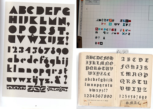
Fontacular: The process of selecting the type and font styles went through quite a few changes – from the initial idea of using one type throughout to the final result of selecting a wide diverse range of styles. The reason for this? My inital mock ups with one or two font styles felt just to subtle, too restricted and didn’t quite fit with the theme. Midsummer nights has a story that tells of losing indivuality and I loved the idea of really going with this and showing seperation in a physical sense – individual lettering, on individual sides, on individual cubes. There was also the puzzle deciding which letters and how many where going to be needed to really let people write what they wanted. Yeh I spent way too long thinking about what people might want to write and making sure it was possible!
Type was selected from existing fonts and also various book samples and type workings, scanning into the computer and vectoring in Illustrator:
Here’s the final image mocked up in Illustrator:
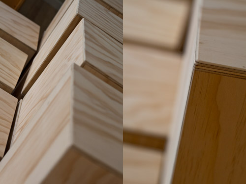
Building time: Once I’d got the lettering, patterns (oops sorry forgot to take shots of those!) and image finalised it was time to get busy making it a 3D reality. Initially the plan was to construct the cubes myself, but due to being the not so proud owner of a broken ankle this was pretty unrealistic. Luckily for me Lars is down the road and he helped me out massively by getting to work making the canvas of 16 plywood (12mm CD untreated) cubes.
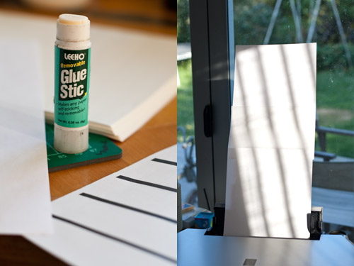
Printing: To get the images onto the cubes I was going to laminate them on. But first I had to print onto a suitable material – the most economical way to do this was using basic tissue paper (rice paper is the slightly better alternative). I prepped all the files to tile in 20 cm wide strips and 40 cm long so I could run them through my standard A4 desktop printer. So after experimenting by cutting up endless amounts of tissue paper for hours, losing quite a few sheets to the printer, getting aforementioned paper out of the inside of the printer, running out of ink, customizing printer feed with a couple of old paint brushes as supports…I found a way of tacking the edges of the tissue paper to regular A4 so it would run through cleanly, Phew!
Laminating: Time to get toxic…with safety mask in hand (face?) and a scribbled layout plan, the carefully stacked tissue pages were placed onto their respective cubes in preparation for laminating.
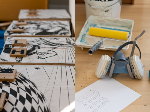
I was using a solar/UV reactive polyurethane resin for this as it allowed me to lay everything up in shaded room and then expose it to the sun to harden extremely quickly. This let me keep goin with the process instead of waiting the usual few hours for hardening usually needed. Spent nearly 3 days in a darkened smelly room doing this…
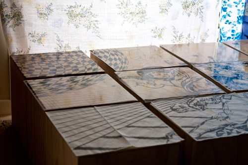
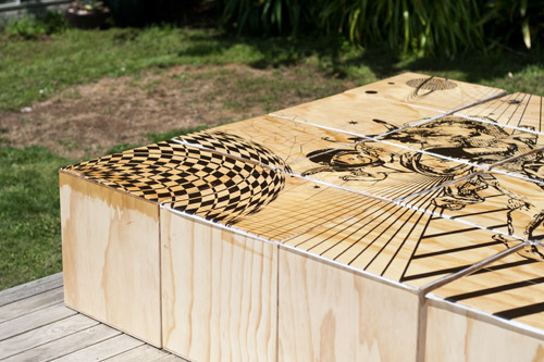
Tidy up: Once a set of sides was complete I’d expose it the rays of light (aaaaahh fresh air!) let it harden, then clean up the edges in prep for the next sides. Here’s me getting busy in the garden…
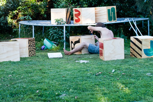

Result! So after a few obstacles, extra things to work out on the way and much hopping around on one foot later, it was great to sit back and see the cubes become a reailty.
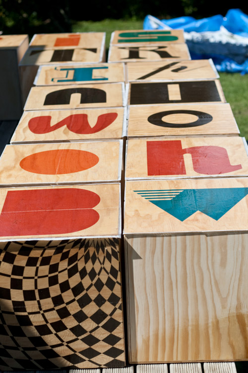
Well almost: Ok so now I realise I’ve missed out documenting the entire final stage of the process…masking off the patterns, spraying colours and spraying a final protective clear coat over all sides to help seal and protect from the elements…but if you’ve made it this far your probably quite glad there isn’t more! If you have any questions about the process just ask.
In action: Check out some photos of my cubes in action at the Splore festival 2010 over on my Flickr!

It takes a lot of creativity, hard work and patience to do that art work. Well done.
Thank you! Was well worth the effort in the end, was really happy with how they came out and seeing them in use and being enjoyed was a great reward